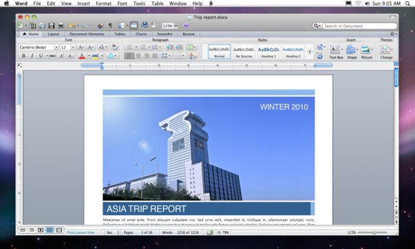
Even though I love Apple’s iWork, I’ve always had a soft spot of Microsoft Office. In my mind, iWork is the sexy Ferari that one takes out to spin once in a while Office is the utilitarian Toyota one takes daily to commute from point A to B.
That is the reason why any Microsoft Office for Mac always attracts my interest. It’s like a clash between 2 ideologies where the Mac, a temple of aesthetics, melds with Microsoft, the makes of Fisher Price blue and lime green themed operating systems like Windows XP. Their offspring can sometimes be wonderful- like the very first version of Microsoft Excel for the Mac or it could be disastrous like Microsoft Office 2008 for Mac.
Microsoft writes really good code for office productivity software. I can’t imagine a day in office where I’m not relying on my trusty Microsoft Outlook to organize my day and flow of information or squeezing meaning out of data dumps with complex pivot tables on Microsoft Excel.
But all that is in the office.
At home, in front my big screen Mac, I just want to have fun while I work. I want to drain my brain from the clumsy and clunky Windows interface and just stare at beautifully crafted icons.
Occasionally, when I need to work on office items, I want to use elegantly designed software like iWork. But Pages and Numbers can only carry me so far. Once in a while, I have to shore up my courage and load Microsoft Office 2008 on my Mac and get the work done.
During those times mentioned above, my Mac is transformed to become a Windows PC. Microsoft Office 2008 for Mac is so badly designed and perplexing, especially for big screen Macs, that J.J. Abrams could have set the story of Lost on the computer screen. Common features are embedded so far deep into the interface that they don’t have the chance to see the light of day.
The good news is that this may change with Microsoft Office for Mac 2011. While it is not a Lexus, Microsoft have learnt a few things and these are the key improvements which I really liked after test driving the Microsoft Office for Mac 2011:-
Fast and more responsive: I’m blown away by the improvements in speed. The applications load up quickly and in matter of fractions of seconds, one can start using Word, Powerpoint or Excel. Letters appear instantly on screen as you type in Microsoft Word. Contrast this to the previous version where the application speed is slow and highly unresponsive, the improvement in performance is one great compelling reason why everyone who is using Microsoft Office 2008 for Mac should upgrade.
Snazzier Templates: Okay, Steve Jobs will probably not use any of the supplied Microsoft PowerPoint templates but they are the best Microsoft Office templates that I had ever seen so far. Much better than any in the PC version—and the best thing is that they are fully compatible which means that there is no need to export great looking presentations from Keynote to Powerpoint.

Improved User Interface: The separate floating “palette” is gone! In its place is the ribbon that first made its appearance in Microsoft Office 2010 for the PC. There is some contention as to whether the ribbon is a better interface but I’ve grown to like it. It is really practical for people like me who have 12 different windows opened at any one point in time.

![Teaserbild_Win10_Devices[1]](http://ckkoay.com/wp-content/uploads/2016/02/Teaserbild_Win10_Devices1.png)
