Stop 114A!

In a further erosion of our rights to free expression on the Internet, all Malaysians should oppose the newly enacted Section 114A of the Malaysian Evidence Act 2012.

This new law is unprecedented in the sense that the innocent are presumed guilty first and the burden of proof is shifted from the prosecutor to the prosecuted. This law has no place in a modern civil society and should be repealed.

More Information can be found at this link: http://stop114a.wordpress.com

Microsoft Office 2011 for Mac

Even though I love Apple’s iWork, I’ve always had a soft spot of Microsoft Office. In my mind, iWork is the sexy Ferari that one takes out to spin once in a while Office is the utilitarian Toyota one takes daily to commute from point A to B.

That is the reason why any Microsoft Office for Mac always attracts my interest. It’s like a clash between 2 ideologies where the Mac, a temple of aesthetics, melds with Microsoft, the makes of Fisher Price blue and lime green themed operating systems like Windows XP. Their offspring can sometimes be wonderful- like the very first version of Microsoft Excel for the Mac or it could be disastrous like Microsoft Office 2008 for Mac.

Microsoft writes really good code for office productivity software. I can’t imagine a day in office where I’m not relying on my trusty Microsoft Outlook to organize my day and flow of information or squeezing meaning out of data dumps with complex pivot tables on Microsoft Excel.

But all that is in the office.

At home, in front my big screen Mac, I just want to have fun while I work. I want to drain my brain from the clumsy and clunky Windows interface and just stare at beautifully crafted icons.

Occasionally, when I need to work on office items, I want to use elegantly designed software like iWork. But Pages and Numbers can only carry me so far. Once in a while, I have to shore up my courage and load Microsoft Office 2008 on my Mac and get the work done.

During those times mentioned above, my Mac is transformed to become a Windows PC. Microsoft Office 2008 for Mac is so badly designed and perplexing, especially for big screen Macs, that J.J. Abrams could have set the story of Lost on the computer screen. Common features are embedded so far deep into the interface that they don’t have the chance to see the light of day.

The good news is that this may change with Microsoft Office for Mac 2011. While it is not a Lexus, Microsoft have learnt a few things and these are the key improvements which I really liked after test driving the Microsoft Office for Mac 2011:-

Fast and more responsive: I’m blown away by the improvements in speed. The applications load up quickly and in matter of fractions of seconds, one can start using Word, Powerpoint or Excel. Letters appear instantly on screen as you type in Microsoft Word. Contrast this to the previous version where the application speed is slow and highly unresponsive, the improvement in performance is one great compelling reason why everyone who is using Microsoft Office 2008 for Mac should upgrade.

Snazzier Templates: Okay, Steve Jobs will probably not use any of the supplied Microsoft PowerPoint templates but they are the best Microsoft Office templates that I had ever seen so far. Much better than any in the PC version—and the best thing is that they are fully compatible which means that there is no need to export great looking presentations from Keynote to Powerpoint.

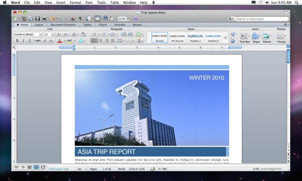
Microsoft Word

Improved User Interface: The separate floating “palette” is gone! In its place is the ribbon that first made its appearance in Microsoft Office 2010 for the PC. There is some contention as to whether the ribbon is a better interface but I’ve grown to like it. It is really practical for people like me who have 12 different windows opened at any one point in time.

Astro B.yond HD

Astro likened the launch of B.yond, its HDTV offering in Malaysia, to the introduction of colour television broadcasting. As unfortunate as it may seems, I am old enough to remember the day when RTM started broadcasting in colour. I recalled the excitement of curious neighbours as they crowd around the rare new colour TV set in the neighbourhood, ahh-ing and ohh-ing ever so often. I also remembered vividly that we would religiously tune into any program that was broadcasted in colour, regardless of the subject matter

While Astro’s B.yond promises high definition (and to most extent and purposes, deliver on that), it is nowhere near as revolutionary as colour transmission.

High definition content is not new. If you are running your PC at resolutions better than 1280 x 720 pixels, it’s already 720p HD. If your puny 2 Megapixel camera takes images at 1600 x 1200 pixels, it already has more height information than 1080p, which is the current highest standard for HD. Bluray discs (and earlier HD-DVD), gaming consoles like PS3 and XBOX360 had gone HD since a couple of years ago.

Therefore, Astro B.yond, unlike colour television, does not have a high novelty factor. It would be hard to imagine your neighbours curiously crashing into your living room to see for themselves what the HDTV fuss is all about, no matter how more lines you can find on the face of David Letterman.

Currently, B.yond only has 4 channels in HD (NatGeo HD, History HD, HBO HD, Astro Supersport HD) with ESPN HD coming soon. To get these channels, Astro requires you to change the dish, decoder, smart card and remote control. The new Set Top Box (STB) is smaller and slicker with a redesigned on-screen menu system. There is an USB port on the front which one may connect memory devices if Astro were to release TiVO like features in the future.

Originally, I had stripped down my Astro subscription to only the bare basics, a form of boycott for the ever increasing bill. What this meant was that I can only watch the documentary channels, so I spent quite a lot of time initially watching Megadisasters, Ice Truckers, Mega Movers, etc. A very little publicized fact is that the programming for the HD channels of NatGeo and History are actually different from the standard definition (SD) channels. The shows may be the same but the scheduling is totally different. However, HBO HD is essentially the same channel as HBO SD except for the 60 minutes delay while Supersports HD is a repackaged Supersports 2 in HD.

The documentary channels look absolutely spectacular. The colours are indeed much richer and there are just so much details in those programs (one can easily read the finer prints on the background or count the number of lines the talking head has on his, er, head).

Inspired, I signed up for the movie package and I got to watch HBO HD.

This is when my excitement got a little doused as the quality of HBO HD was not as great as the documentary HD channels. Perhaps it’s the compression profile that Astro uses for this channel but pictures look softer and filled with blocky compression artefacts, especially during action sequences. Some scenes are quite unwatchable and remind me of badly recompressed pirated DVDs.

Another big beef that I have is with the sound. Even though Astro B.yond touts having Dolby Digital sound, the quality is really bad. The audio channels are often encoded wrongly. The most common mistake that happens in the NatGeo HD and HBO HD channel is that the vocals are not only coming out from the centre speaker, they are also coming out from the left and right speakers. To make things worse, the same vocal track is not even in synch! This slight delay between the center and other speakers creates a wierd off-phased vocal effect that is just downright irritating.

To succeed in this game, Astro would have to bring more care into rolling out this service. With 4 channels today, it is unlikely that they will get conversions from the masses, except maybe during the World Cup 2010 period where all the games will be broadcast in HD. This initial wave of interest today is attracting early adopting HD geeks like me who won’t mind paying RM 20 more per month to enjoy the technology. To get the masses, they would have to fix the faults and ramp up on HD content very quickly. That’s because after watching the HD channels, people would wise up and realize that Astro’s standard SD offerings looks really, really bad.

Directions to Lake Fields

For those who are coming to the morning session of Celeste and Ming Han’s wedding, here are some quick directions to Lake Fields.

Directions from Kesas (Lebuhraya Shah Alam) to Lake Fields

1.

After the KESAS toll, travel eastward on KESAS towards KL

4.0 km

2.

Take right fork towards Cheras. You will be now on Middle Ring Road 2 (MRR 2)

2.0 km

3.

Look out for Bandar Tasik Selatan LRT station on left. Take left ramp and make a U-turn to the other side of MRR 2

0.3 km

4.

Continue on MRR 2 until you see the turning to Serdang, Balakong, UPM on the left

1.7 km

5.

Take that turning and continue straight. You will come across a traffic light. The Sg Besi LRT station is on your left

0.2 km

6.

Continue straight and take flyover on the left that says Lake Fields

0.3 km

See Google Map

Directions from Federal Highway to Lake Fields

1.

Head east on Lebuhraya Persekutuan towards Kuala Lumpur

0.2 km

2.

As you pass MidValley on your left, take the exit onto Jalan Klang Lama

3.1 km

3.

Travel straight and turn left at Jalan Kuchai Lama

2.6 km

4.

Continue straight all the way and you will be travelling on Lebuhraya Sungai Besi

4.0 km

5.

Take “Lake Fields” ramp when you come to a 3-fork that says Sg. Besi/Cheras (left), Lake Fields (centre) and Serdang/Balakong (right)

0.4 km

See Google Map

Directions from KL Seremban Highway to Lake Fields

Take the Cheras exit from KL-Seremban Highway

0.1 km

Take the left ramp to Sungai Besi (via Lebuhraya Sungai Besi) *warning: do not take leftest ramp to Putrajaya

56 m

Keep right at the fork to continue toward Lebuhraya Sungai Besi (towards KL)

1.0 km

Make a U-turn

2.5 km

Continue straight on Lebuhraya Sungai Besi (towards Serdang)

4.1 km

Take “Lake Fields” ramp when you come to a 3-fork that says Sg. Besi/Cheras (left), Lake Fields (centre) and Serdang/Balakong (right)

0.4 km

See Google Map

When you reach Lake Fields, you will see white 3 storey houses that look something like this:-

The Lost Symbol

I have a confession to make.

I would lust after Kentucky Fried Chicken and would feel really bad after eating it. Not from a guilt point of view due to unhealthy indulgence. Nope, I really do physically feel bad after finishing the last piece of fried chicken that has been secretly embalmed with 11 herbs and spices. It always leaves a peculiar after-taste that can be described as a bad combination of sickeningly creamy grease, refrigerated overnight chicken soup and sweaty salty skin.

Which is like the new Dan Brown book, The Lost Symbol. While I couldn’t resist the marketing messages which promoted this book like it is the sequel to the Holy Bible, the feeling that I get after completing it can be described as a bad combination of sickeningly ill-constructed scenes and dialogues, refrigerated plots from previous books and conspiracy theories and non-sweaty predictable plot twists.

In this novel, Dan Brown took familiar plot elements from The DaVinci Code, Angels & Demons, Deception Point and Digital Fortress and transported the story to Washington D.C. This time around, a diabolical and murderous villain with the moniker of Mal’akh forces Robert Langdon to once again solve puzzles based on long lost symbols. I wouldn’t write anything more about the plot because the book has nothing else going for it and I do not want to spoil it in case one wants to read this book or wait for the Tom Hanks movie version of the book.

What I’ve discovered when reading The Lost Symbol is that Dan Brown has unabashedly recycled plot elements and characters from his old novels. (For those who do not like spoilers, skip to the last paragraph now).

For instance:-

  • Robert Langdon is forced into solving the puzzles
  • Female co-lead is forced into the situation too
  • It’s a race against time
  • The secret that is such a big deal is always hidden in plain sight in paintings, buildings, etc
  • The secret, if made known to all, will cause massive chaos and disorder
  • There is a an official from hell who apparently hampers Langdon and his female co-lead but who eventually turns out to be one of the good guys after all

The saving grace to this book is that with all the flaws it is still fun to read. That is if one lowers one’s expectations enough to read it for the pulp fiction value that it is and nothing more.

dsdI have a confession to make.
I would lust after Kentucky Fried Chicken and would feel really bad after eating it. Not from a guilt point of view due to unhealthy indulgence. Nope, I really do physically feel bad after finishing the last piece of fried chicken that has been secretly embalmed with 11 herbs and spices. It always leaves a peculiar after-taste that can be described as a bad combination of sickeningly creamy grease, refrigerated overnight chicken soup and sweaty salty skin.
Which is like the new Dan Brown book, The Lost Symbol. While I couldn’t resist the marketing messages which promoted this book like it is the sequel to the Holy Bible, the feeling that I get after completing it can be described as a bad combination of sickeningly ill-constructed scenes and dialogues, refrigerated plots from previous books and conspiracy theories and non-sweaty predictable plot twists.
In this novel, Dan Brown took familiar plot elements from The DaVinci Code, Angels & Demons, Deception Point and Digital Fortress and transported the story to Washington D.C. This time around, a diabolical and murderous villain with the moniker of Mal’akh forces Robert Langdon to once again solve puzzles based on long lost symbols. I wouldn’t write anything more about the plot because the book has nothing else going for it and I do not want to spoil it in case one wants to read this book or wait for the Tom Hanks movie version of the book.
What I’ve discovered when reading The Lost Symbol is that Dan Brown has unabashedly recycled plot elements and characters from his old novels. (For those who do not like spoilers, skip to the last paragraph now).
For instance:-
Robert Langdon is forced into solving the puzzles
Female co-lead is forced into the situation too
It’s a race against time
The secret that is such a big deal is always hidden in plain sight in paintings, buildings, etc
The secret, if made known to all, will cause massive chaos and disorder
There is a an official from hell who apparently hampers Langdon and his female co-lead but who eventually turns out to be one of the good guys after all
The saving grace to this book is that with all the flaws it is still fun to read. That is if one lowers one’s expectations enough to read it for the pulp fiction value that it is and nothing more.